Every business wants a beautiful website. But not every beautiful website works.
That’s because good design isn’t just about how it looks — it’s about how it feels and functions for the user.
In this article, we’ll uncover the most common web design mistakes that silently hurt user experience (UX), reduce conversions, and make visitors click the “X” button — and more importantly, how to fix them.
⚠️ 1. Cluttered Layouts — Too Much Going On
When every inch of your homepage is filled with banners, pop-ups, and widgets, users don’t know where to look.
This overload creates decision fatigue and confusion.
✅ Fix:
- Embrace white space.
- Focus on one key message per screen.
- Use clear visual hierarchy — titles, subheadings, and concise content.
Remember: Empty space is not wasted space. It’s breathing room for your design.
🧭 2. Confusing Navigation
A website is like a map — if users can’t find the path, they’ll leave.
Overly complex menus or buried pages create frustration.
✅ Fix:
- Keep the navigation simple and predictable.
- Use familiar words like “Home,” “About,” “Services,” and “Contact.”
- Limit top-level menu items to 5–7.
- Ensure all important pages are accessible within 2–3 clicks.
🖋️ 3. Poor Typography Choices
Fonts communicate emotion and tone — but when done wrong, they destroy readability.
Tiny text, too many font types, or low contrast between text and background are instant turn-offs.
✅ Fix:
- Choose legible, web-safe fonts (e.g., Poppins, Lato, Inter, Open Sans).
- Maintain a minimum font size of 16px for body text.
- Use contrast tools to ensure text visibility on all devices.
🎨 4. Ignoring Color Harmony
Color sets the emotional tone of your brand.
If your color palette clashes, looks too bright, or lacks consistency, users lose trust.
✅ Fix:
- Stick to a primary + secondary + accent color scheme.
- Use color psychology — blue (trust), green (growth), black (elegance), orange (energy).
- Ensure sufficient contrast between text and background.
OliveGrid Tip: A well-balanced color palette improves user retention and emotional connection.
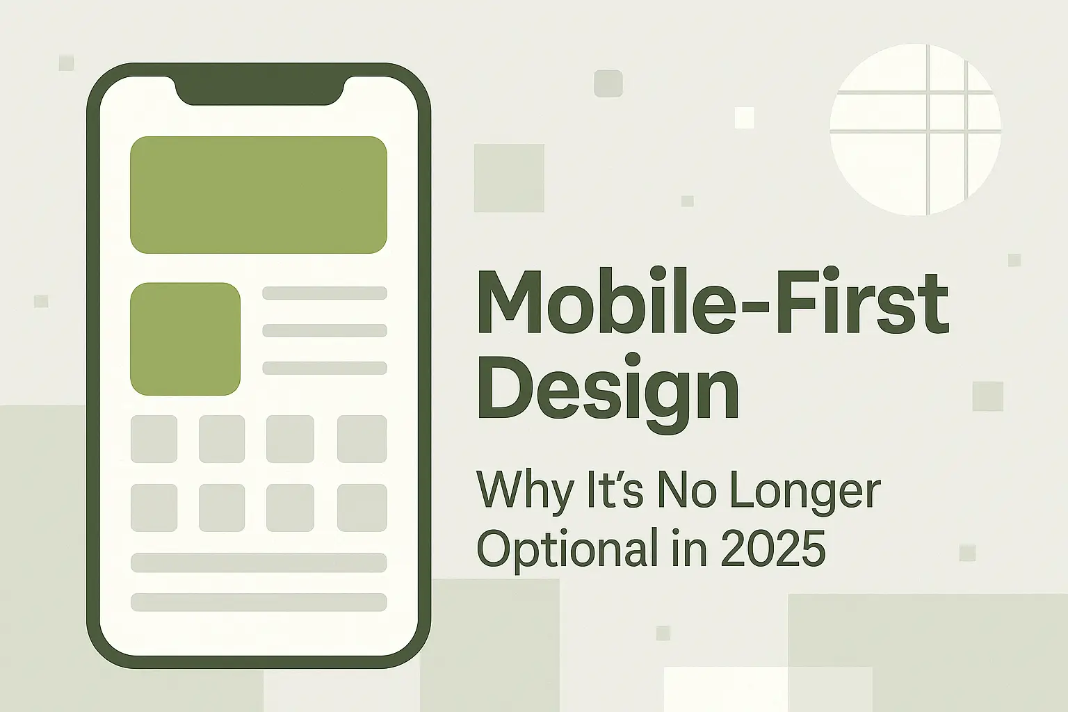
📱 5. Non-Responsive Design
Over 70% of visitors browse from mobile devices — yet many websites still fail to adapt.
If your site breaks, overlaps, or hides elements on smaller screens, you’re losing users fast.
✅ Fix:
- Use mobile-first design principles.
- Test across multiple devices and resolutions.
- Ensure touch-friendly buttons and simplified menus for smaller screens.
⚙️ 6. Slow Loading Speed
No one likes to wait.
According to Google, if your site takes more than 3 seconds to load, over 50% of users will leave.
✅ Fix:
- Optimize images (use WebP or compressed JPEGs).
- Use caching and a fast hosting provider.
- Minimize CSS and JavaScript files.
- Leverage lazy loading for images.
🧩 7. Ignoring Content Hierarchy
If every element on your website screams for attention, users get lost.
A lack of visual hierarchy means users don’t know what to read first.
✅ Fix:
- Highlight important content using larger fonts, bold text, or color emphasis.
- Guide users’ eyes with logical flow — headline → subheading → call-to-action.
- Group related content using spacing and alignment.
🧠 8. Weak Call-to-Action (CTA)
A beautiful design is useless if it doesn’t drive action.
Unclear or missing CTAs confuse users about what to do next.
✅ Fix:
- Use action-driven text: “Get Started,” “Request a Quote,” “Download Now.”
- Make CTAs visible, consistent, and contextual.
- Place one clear CTA per section or page.
🧍 9. Neglecting Accessibility
Accessibility isn’t optional — it’s a necessity.
Ignoring contrast, alt tags, or keyboard navigation alienates differently-abled users and even affects SEO.
✅ Fix:
- Add alt text for images.
- Ensure keyboard navigability.
- Use ARIA labels for screen readers.
- Maintain high color contrast ratios.
🔍 10. Not Considering SEO in Design
A stunning design is pointless if no one can find it.
Design and SEO must work together to attract and retain visitors.
✅ Fix:
- Use clean, semantic HTML.
- Include proper heading tags (H1–H3 hierarchy).
- Optimize images with descriptive filenames.
- Maintain lightweight code and responsive layouts.
🌿 Conclusion
Web design isn’t just about visual appeal — it’s about creating an experience that feels effortless, intuitive, and meaningful.
Avoiding these 10 common mistakes can instantly transform your website from average to exceptional.
At OliveGrid, we believe the best designs blend creativity and structure — because when design and user experience are in balance, everything flows naturally.
Vikram Chouhan is a Web Designer from Udaipur and the Founder of 3i Planet, a global web design company known for creative, SEO-friendly websites.
Through OliveGrid, Vikram shares insights from over a decade of experience in design, WordPress, and SEO — helping creators worldwide design smarter, simpler, and more beautifully.