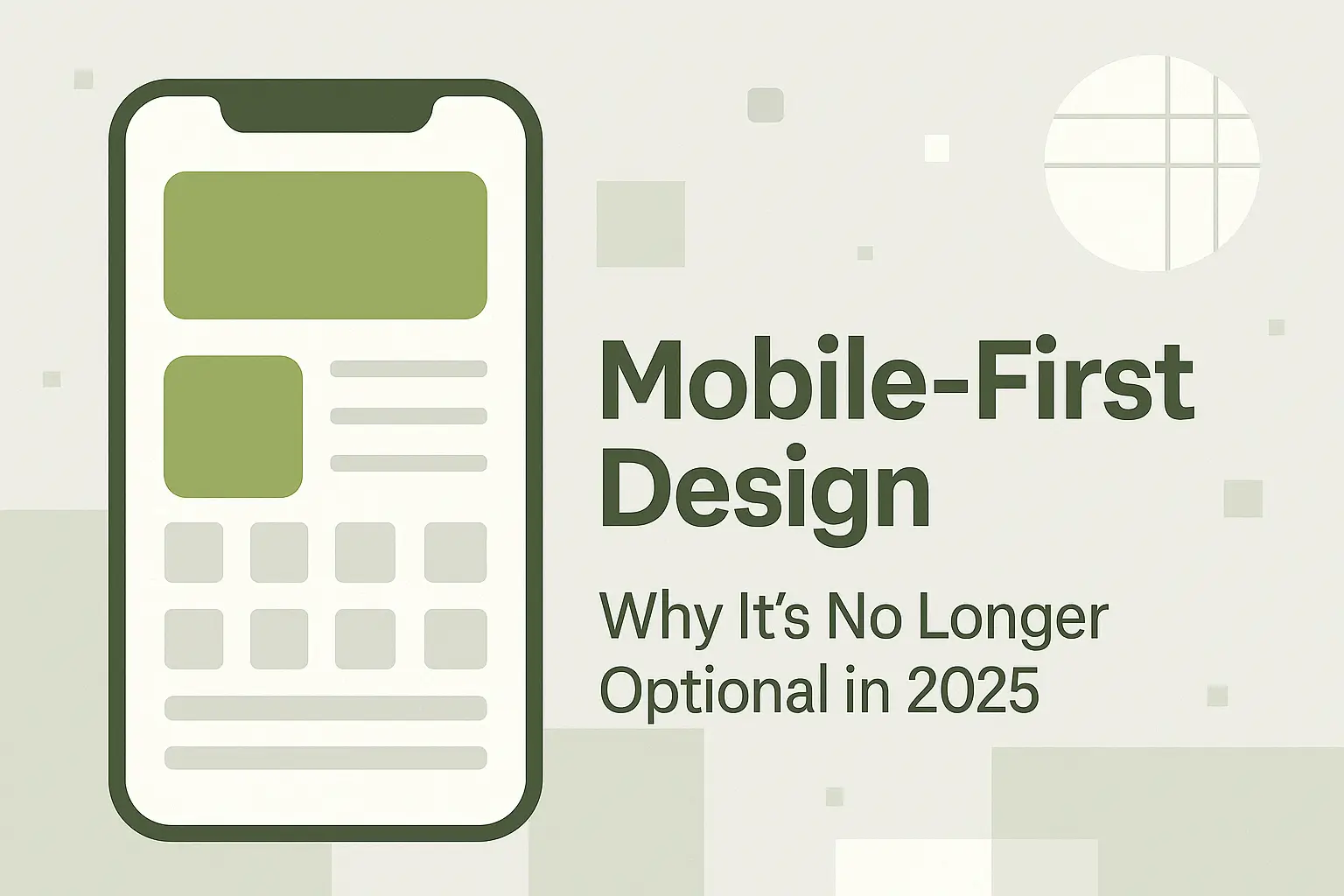
In 2025, it’s simple — if your website doesn’t look great on a phone, it’s already outdated.
With more than 75% of web traffic coming from mobile devices, Mobile-First Design isn’t just a design choice anymore — it’s a necessity.
At OliveGrid, we believe that a modern website must start from the smallest screen and grow upward — not the other way around.
📱 What Is Mobile-First Design?
Mobile-first design is a design approach where you design for mobile devices first, and then scale up for larger screens like tablets and desktops.
It’s a shift in mindset — instead of shrinking your desktop layout, you build for mobile users first and expand the experience progressively.
This philosophy ensures your website is fast, functional, and user-friendly on every device.
⚙️ Why Mobile-First Design Matters
1. Google Prioritizes Mobile-Friendly Websites
Since Google switched to mobile-first indexing, it now uses the mobile version of your site for ranking and indexing.
If your site isn’t mobile-optimized, you’re losing SEO performance.
✅ Tip: Use Google’s Mobile-Friendly Test Tool to check your site’s status.
2. Mobile Users Dominate Web Traffic
Over 75% of global users access websites through smartphones.
If your design isn’t built for them, you’re ignoring the majority of your visitors.
✅ Tip: Ensure your layout adapts fluidly to all mobile screen sizes — especially 360px to 480px width.
3. Improved User Experience (UX)
Mobile-first design forces simplicity.
You prioritize essential content, remove clutter, and streamline navigation — leading to faster, more enjoyable browsing.
✅ Tip: Think thumb-friendly design — buttons, menus, and CTAs must be easily tappable.
4. Faster Page Load Speeds
Simpler mobile-first layouts mean fewer elements, optimized images, and faster loading — which leads to better retention and SEO.
✅ Tip: Use modern image formats (WebP/AVIF) and lazy loading for best performance.
5. Better Conversion Rates
A mobile-optimized site means fewer frustrations, higher trust, and smoother checkout or contact processes.
✅ Tip: Keep CTAs clearly visible and avoid forcing users to zoom or scroll horizontally.
💡 The OliveGrid Perspective
At OliveGrid, we view Mobile-First Design as the natural evolution of digital structure — the perfect example of creativity meeting functionality.
Just like our name suggests, we believe in organic creativity (“Olive”) built upon strong structure (“Grid”) — and mobile-first embodies that principle beautifully.
“Good web design doesn’t just resize — it rethinks the experience.”
🧭 How to Implement Mobile-First Design
- Start small: Begin your design on a 360px canvas.
- Use responsive frameworks: Tailwind CSS, Bootstrap, or CSS Grid.
- Focus on essential content: Display what users need most.
- Use fluid typography and flexible grids.
- Test continuously: Use Chrome DevTools to emulate devices.
🔍 Tools for Testing Mobile Design
- Google Mobile-Friendly Test – to check compliance.
- Responsinator.com – for multi-device previews.
- BrowserStack – test real devices virtually.
- Figma / Adobe XD – for responsive wireframes.
🌿 Final Thoughts
In 2025 and beyond, mobile-first isn’t just smart — it’s survival.
Designers who think small first end up building bigger ideas that work everywhere.
So when you design your next website, remember:
Start mobile, scale up, and let structure guide creativity.
That’s the OliveGrid way.
Vikram Chouhan is a Web Designer from Udaipur and the Founder of 3i Planet, a global web design company known for creative, SEO-friendly websites.
Through OliveGrid, Vikram shares insights from over a decade of experience in design, WordPress, and SEO — helping creators worldwide design smarter, simpler, and more beautifully.