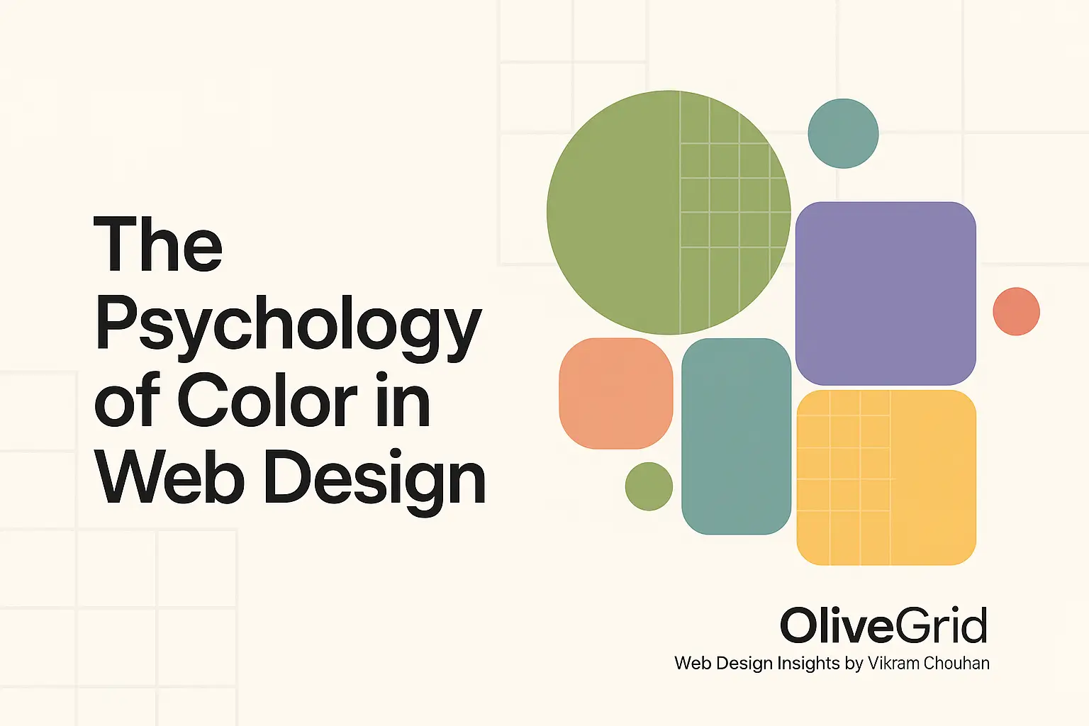
When it comes to web design, color isn’t just decoration — it’s communication.
Every shade evokes emotion, influences perception, and guides user behavior.
In fact, studies show that people form a subconscious judgment about a product within 90 seconds — and up to 90% of that assessment is based on color.
That’s why choosing the right color palette for your website is not just a design choice — it’s a business decision.
At OliveGrid, we believe great web design is a harmony between visual appeal and emotional balance — and color plays a vital role in achieving that.
🎨 Why Color Psychology Matters in Web Design
Colors influence how users feel, think, and act on your website.
They can:
- Build trust
- Increase conversions
- Improve readability
- Strengthen brand recognition
The wrong color choices, on the other hand, can create confusion, fatigue, or even drive visitors away.
“Good color design doesn’t just look right — it feels right.”
🌈 Understanding the Psychology of Common Colors
Here’s what different colors typically communicate in digital design:
| Color | Emotion | Best Used For |
|---|---|---|
| Blue | Trust, Calmness, Security | Corporate sites, tech companies, finance |
| Green | Growth, Balance, Freshness | Eco-friendly brands, health, nature |
| Red | Energy, Urgency, Passion | E-commerce, promotions, entertainment |
| Yellow | Optimism, Happiness, Warmth | Creative studios, kids’ brands, lifestyle blogs |
| Orange | Confidence, Enthusiasm, Fun | Calls-to-action, startups, youth brands |
| Black | Luxury, Power, Sophistication | High-end brands, fashion, portfolios |
| White | Purity, Simplicity, Space | Minimalist design, tech, creative portfolios |
| Purple | Imagination, Wisdom, Royalty | Beauty, education, spiritual content |
| Gray | Neutrality, Stability | Backgrounds, typography, corporate design |
🧠 How to Choose the Right Palette for Your Website
1. Know Your Audience
Colors that appeal to teenagers may not resonate with corporate clients.
Define your audience’s demographics, preferences, and emotional triggers before selecting colors.
2. Reflect Your Brand Personality
Ask yourself:
- Is your brand playful or professional?
- Energetic or calm?
- Bold or minimal?
Your palette should mirror your brand’s character.
3. Follow the 60-30-10 Rule
A proven formula in design balance:
- 60% primary color (background or dominant hue)
- 30% secondary color (complementary or support tone)
- 10% accent color (for highlights, CTAs, or focus areas)
This ensures visual harmony and professional balance.
4. Ensure Contrast & Accessibility
Good design isn’t just aesthetic — it’s inclusive.
Make sure your color combinations pass WCAG contrast guidelines, ensuring legibility for all users.
Use tools like:
- Contrast Checker (WebAIM)
- Coolors.co
- Adobe Color
5. Test Before Finalizing
Colors can look different across screens and lighting conditions.
Always preview your palette on multiple devices — desktop, mobile, and tablet — before publishing.
💡 Real-World Examples
- Google uses vibrant, balanced colors to convey playfulness and diversity.
- Apple relies on clean white space and grayscale tones for simplicity and luxury.
- Coca-Cola dominates with energetic red — passion and excitement.
Each brand uses color to tell a story — and consistency makes their design instantly recognizable.
🌿 The OliveGrid Perspective
At OliveGrid, “Olive” represents creativity, freshness, and balance, while “Grid” signifies structure and order.
That’s exactly how we treat color — a blend of emotional creativity and logical structure.
We choose palettes not just for aesthetics, but for purpose and feeling.
In good design, color isn’t random — it’s intentional.
🚀 Pro Designer Tip
When designing for clients:
- Present 3 color palette options — minimal, bold, and balanced.
- Use mood boards to visualize color impact.
- Always test CTAs — sometimes a simple color tweak can double conversions.
🌈 Final Thoughts
Color is one of the most powerful tools in web design — it shapes perception, builds emotion, and drives action.
Choose your palette with intent.
Design with emotion, test with logic, and remember:
“When creativity meets structure, color becomes communication.”
That’s the OliveGrid philosophy.
Vikram Chouhan is a Web Designer from Udaipur and the Founder of 3i Planet, a global web design company known for creative, SEO-friendly websites.
Through OliveGrid, Vikram shares insights from over a decade of experience in design, WordPress, and SEO — helping creators worldwide design smarter, simpler, and more beautifully.